Spectrograph Demo
In addition to supporting simulations with that apply filters to provide bandfluxes, LightCurveLynx also provides the ability to generate spectra at different time steps.
Spectrograph
The core class used for generating spectra is the Spectrograph class, which defines information on the bins and sensitivity of the instrument. A user defines a spectrograph instrument by passing an array of bin centers (wavelength in Angstroms) and an optional array of per-bin scales.
[1]:
import matplotlib.pyplot as plt
import numpy as np

from lightcurvelynx.astro_utils.spectrograph import Spectrograph

bin_centers = np.arange(4000, 8000, 100)
my_spectrograph = Spectrograph(bin_centers)
The spectrograph’s evaluate() function is then used to turn a model’s SED into spectrograph readings.
Let’s look at a concrete function where we evaluate the spectrograph of sncosmo’s SALT2 model.
[2]:
from lightcurvelynx.models.sncosmo_models import SncosmoWrapperModel

model = SncosmoWrapperModel(
    "salt2-h17",  # Model name
    t0=53370.5,
    x0=100.0,
    x1=0.01,
    c=0.001,
    ra=0.0,
    dec=0.0,
    redshift=0.05,
    node_label="source",
)
/home/docs/checkouts/readthedocs.org/user_builds/lightcurvelynx/envs/latest/lib/python3.12/site-packages/tqdm/auto.py:21: TqdmWarning: IProgress not found. Please update jupyter and ipywidgets. See https://ipywidgets.readthedocs.io/en/stable/user_install.html
  from .autonotebook import tqdm as notebook_tqdm
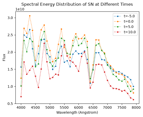
We can evaluate the modeled SEDs at a few times (2 days before t0, t0, 2 days after t0, 5 days after t0). We use the bin’s wavelength centers as our evaluation points.
[3]:
times = 53370.5 + np.array([-5.0, 0.0, 5.0, 10.0])
seds = model.evaluate_sed(times, my_spectrograph.waves)
spectra = my_spectrograph.evaluate(seds)

plt.plot(my_spectrograph.waves, spectra[0], marker=".", linestyle=":", label="t=-5.0")
plt.plot(my_spectrograph.waves, spectra[1], marker=".", linestyle=":", label="t=0.0")
plt.plot(my_spectrograph.waves, spectra[2], marker=".", linestyle=":", label="t=5.0")
plt.plot(my_spectrograph.waves, spectra[3], marker=".", linestyle=":", label="t=10.0")
plt.xlabel("Wavelength (Angstrom)")
plt.ylabel("Flux")
plt.title("Spectral Energy Distribution of SN at Different Times")
_ = plt.legend()
Using in Simulations
We can include spectrograph readings into our normal simulation workflow by adding an ObsTable with the spectrograph’s pointings and a “PassbandGroup” that is just the spectrograph instrument itself. While any ObsTable subclass can be used (all that matters is the pointing information), we have provided a minimal SpectrographObsTable that uses a tighter radius and does not require zero point or filter information.
We start by creating a fake observation table that includes points at our object and away from our object.
[4]:
from lightcurvelynx.obstable.spectrograph_table import SpectrographObsTable

data = {
    "ra": [0.0, 10.0, 0.0, 0.0, 10.0, 0.0],
    "dec": [0.0, -10.0, 0.0, 0.0, -10.0, 0.0],
    "time": 53370.5 + np.array([-5.0, -2.0, 0.0, 5.0, 7.0, 10.0]),
}
osbtable = SpectrographObsTable(data)
As of version 0.4.0, we wrap all the survey related information in a SurveyInfo object.
[5]:
from lightcurvelynx.survey_info import SurveyInfo

survey_info = SurveyInfo(
    obstable=osbtable,
    passbands=my_spectrograph,  # The spectrograph is used as the passband information for the survey.
    survey_name="spectrograph",
)
We can then just pass the model, survey information, and spectrograph to the simulation function.
[6]:
from lightcurvelynx.simulate import simulate_lightcurves

results = simulate_lightcurves(
    model,  # The model we are simulating.
    1,  # The number of simulations to run,
    survey_info,  # The survey information, which includes the observation times and passbands.
)
results.head()
Simulating: 100%|██████████| 1/1 [00:00<00:00, 1565.62obj/s]
[6]:
| id | ra | dec | nobs | t0 | z | lightcurve | params | spectra | |||||||||||||
|---|---|---|---|---|---|---|---|---|---|---|---|---|---|---|---|---|---|---|---|---|---|
| 0 | 0 | 0.000000 | 0.000000 | 4 | 53370.500000 | 0.050000 | None | {'source.ra': 0.0, 'source.dec': 0.0, 'source.redshift': 0.05, 'source.t0': 53370.5, 'source.distance': None, 'source.x0': 100.0, 'source.x1': 0.01, 'source.c': 0.001} |
|
The results look like the table for a normal simulation, but contain an additional “spectra” nested column. Each row of the nested data contains the time, instrument, list of wavelengths, and list of measured values.
Out of the six observations in our fake table, four of them part pointed at the object. So the results include 4 spectra.
[7]:
row_0_spectra_table = results.iloc[0]["spectra"]
row_0_spectra_table
[7]:
| mjd | waves | measured_flux | instrument | |
|---|---|---|---|---|
| 0 | 53365.5 | [4000, 4100, 4200, 4300, 4400, 4500, 4600, 470... | [15682185147.797709, 24973918037.932724, 24300... | Spectrograph |
| 1 | 53370.5 | [4000, 4100, 4200, 4300, 4400, 4500, 4600, 470... | [12455534936.643265, 26977254585.81967, 254549... | Spectrograph |
| 2 | 53375.5 | [4000, 4100, 4200, 4300, 4400, 4500, 4600, 470... | [10150830360.573153, 23361566683.193764, 20152... | Spectrograph |
| 3 | 53380.5 | [4000, 4100, 4200, 4300, 4400, 4500, 4600, 470... | [7025516423.327714, 17133448648.565697, 135788... | Spectrograph |
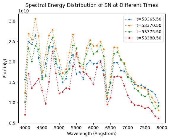
We can plot the resulting spectra. As expected, they are identical to the manually generated spectra.
[8]:
row_0_spectra_table = results.iloc[0]["spectra"]
for row_idx in range(len(row_0_spectra_table)):
    plt.plot(
        row_0_spectra_table.iloc[row_idx]["waves"],
        row_0_spectra_table.iloc[row_idx]["measured_flux"],
        marker=".",
        linestyle=":",
        label=f"t={row_0_spectra_table.iloc[row_idx]['mjd']:.2f}",
    )
plt.xlabel("Wavelength (Angstrom)")
plt.ylabel("Flux (nJy)")
plt.title("Spectral Energy Distribution of SN at Different Times")
_ = plt.legend()
Caveats
The spectrograph code is still in development and does not simulate noise yet.